1. Introduction
In this case study, I explore the design process and user experience enhancement for a taco food truck, completed as part of the Google UX Design Program. This project aims to improve customer interactions and increase sales through a user-centered design approach.
2. Project Overview
The primary objective of this project was to design an effective and efficient user interface for a taco food truck, enabling a seamless ordering process. The project involved understanding user needs, creating prototypes, conducting usability studies, and refining the design based on feedback.
Attached the presentation that I submitted to the course.
3. Understanding the User
User Research
To begin, extensive user research was conducted to gather insights into the target audience’s behaviors, preferences, and pain points.
Methods included surveys, interviews.
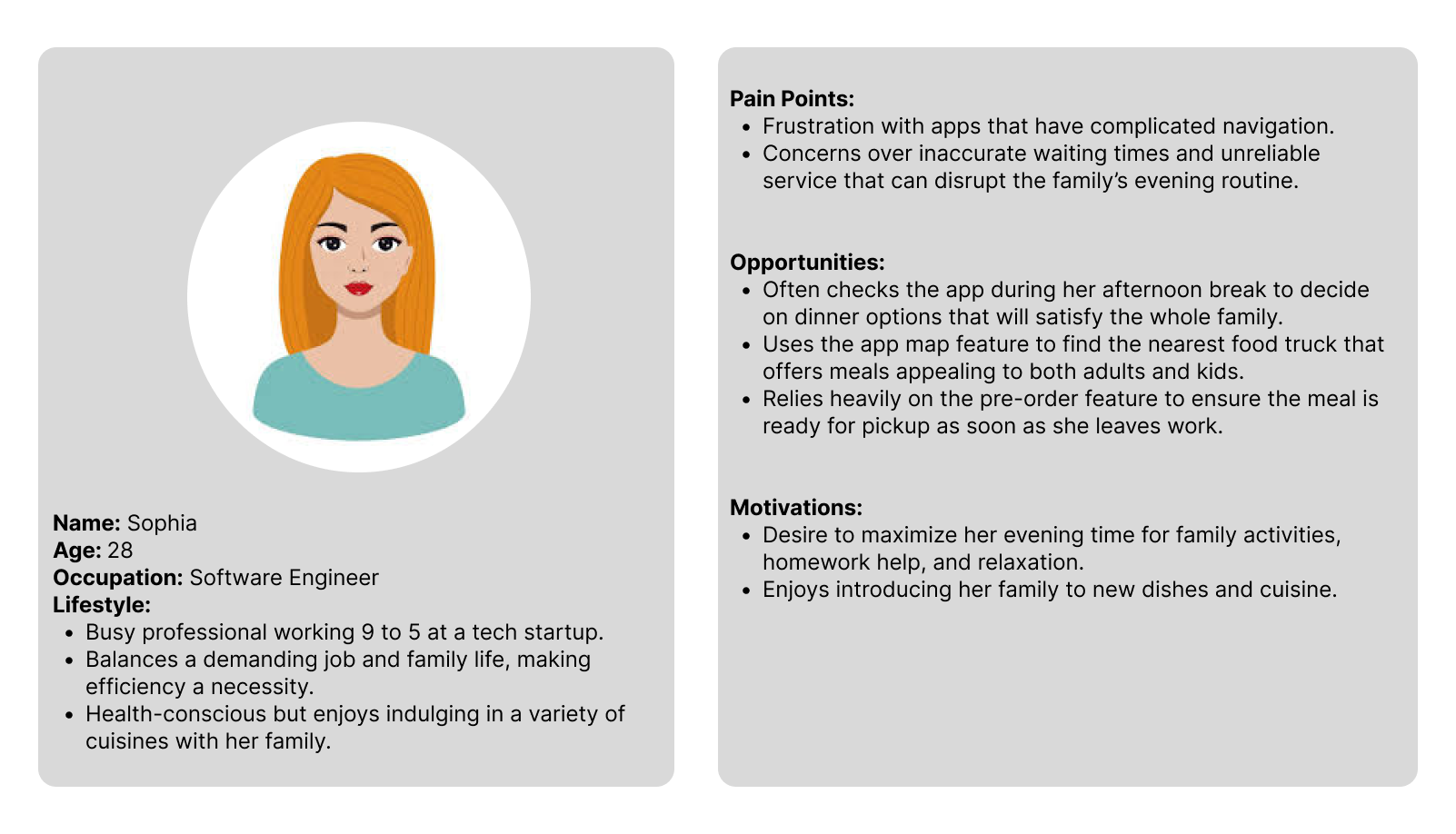
Personas
Based on the research, a user persona Sophia, was developed representing typical users of the taco food truck, goals, and user needs.
User Problem Statement
Customers struggle with finding the taco food truck’s location and face long wait times, an inefficient ordering process, limited payment options, and poor menu visibility, which collectively diminish satisfaction and could result in lost sales.
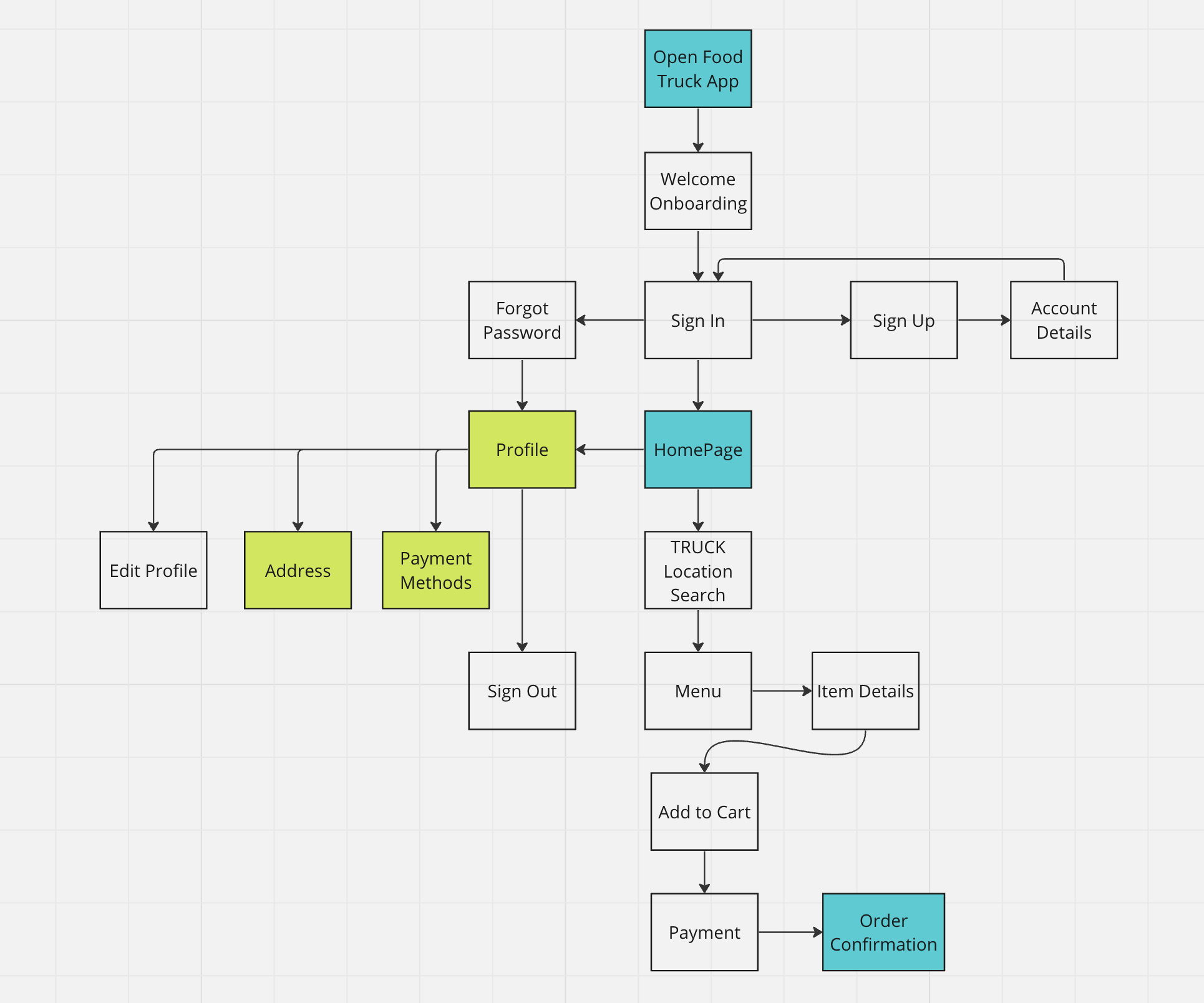
User Journey Map
A user journey map was created to visually represent the steps taken by users from discovering the food truck to receiving their order. This tool helped identify key interaction points that needed design improvements.
4. Design Process
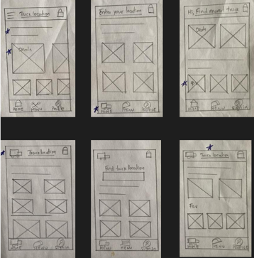
Paper Wireframes
The design process began with sketching paper wireframes. These initial sketches provided a way to brainstorm and iterate on layout and functionality ideas quickly.
Taking the time to draft iterations of each screen of the app on paper ensured that the elements that made it to digital wireframes would be well-suited to address user pain points. For the home screen, I prioritized a quick and easy ordering process to help users save time.
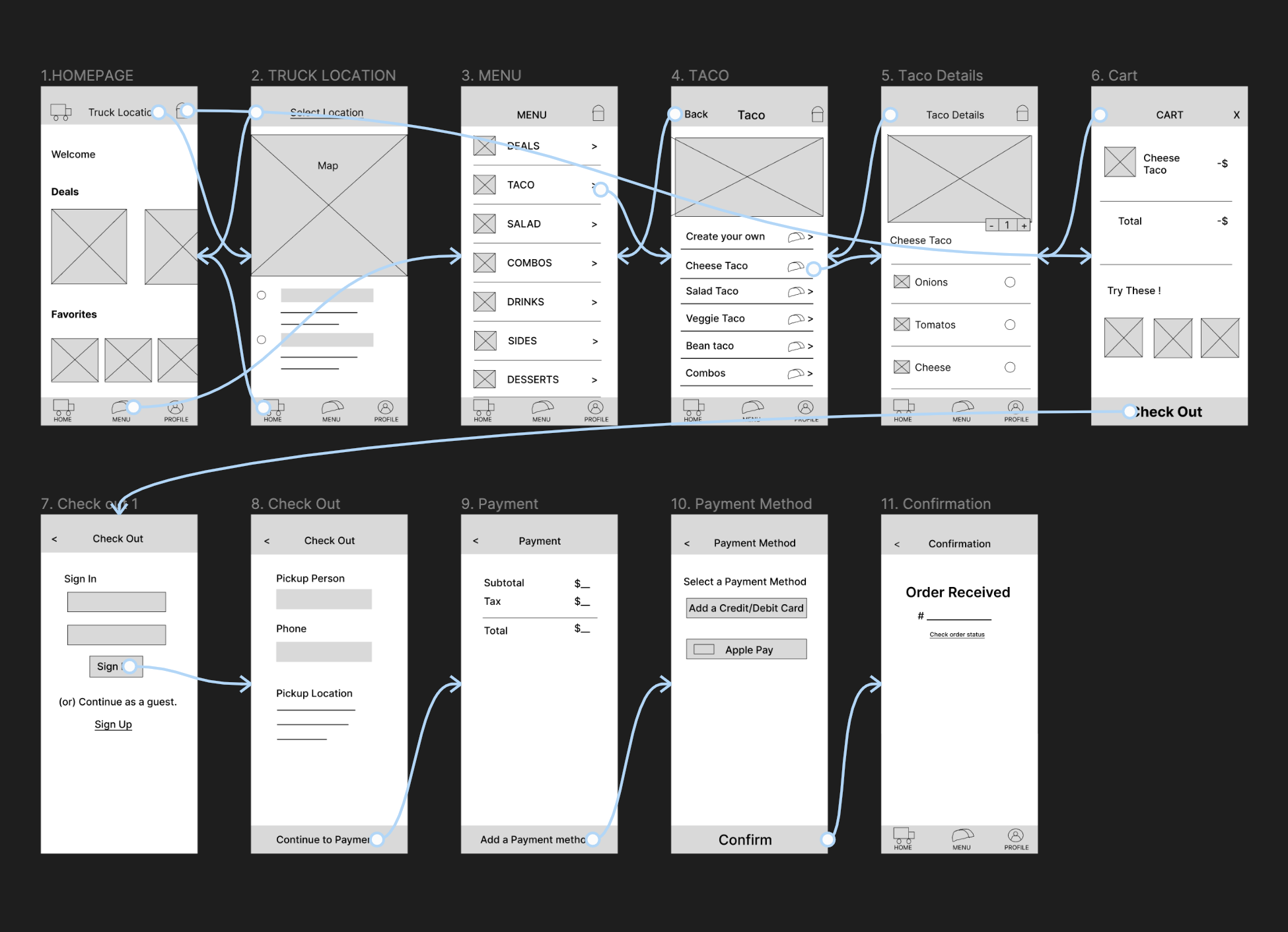
Digital Wireframes
Moving from paper to digital allowed for refining the wireframes and testing layout variations more effectively. As the initial design phase continued, I made sure to base screen designs on feedback and findings from the user research. I used Figma to do this.
Low Fidelity Prototypes
A low-fidelity prototype of the interface was developed, focusing on functionality rather than aesthetic details. This prototype was crucial for early-stage user testing and feedback.
Usability Study
A usability study was conducted using the low-fidelity prototypes. Observations and user feedback highlighted usability issues and unmet user needs, guiding further refinement of the design.
5. Redefining the Design
Mockups
Detailed mockups were created to visualize the aesthetics and layout of the final product. Color schemes, typography, and iconography were finalized during this stage.
High Fidelity Prototype
A high-fidelity prototype was developed, incorporating all visual and interaction design elements. This prototype was used in further usability testing to ensure the design met user expectations and was intuitive to use.
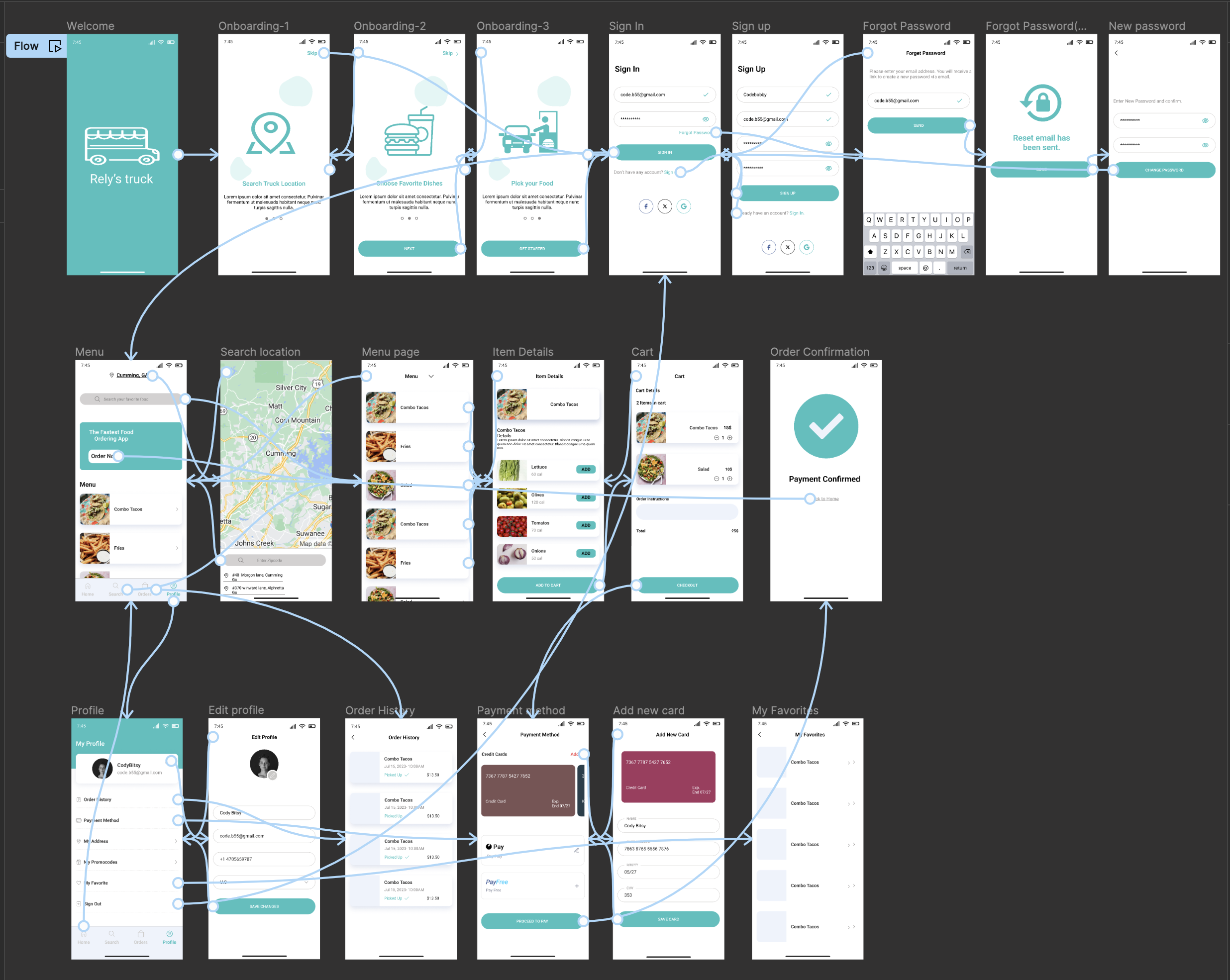
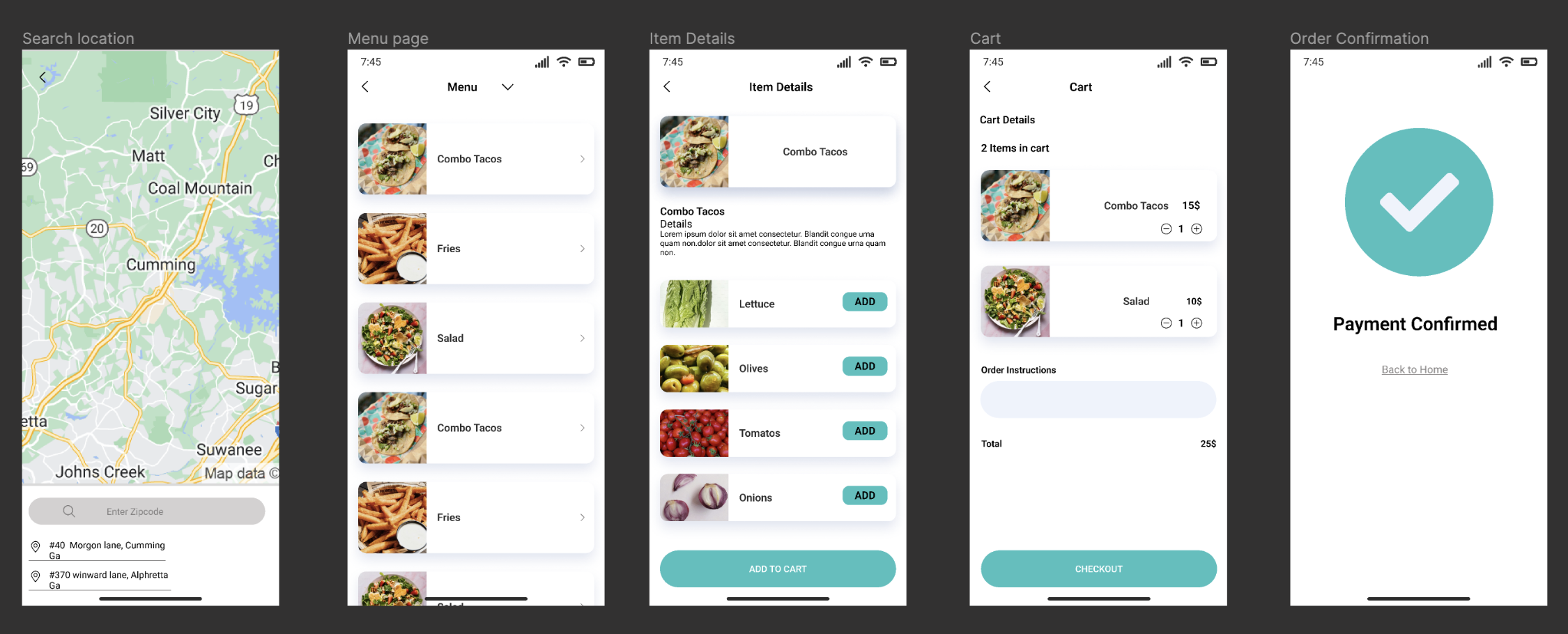
6. Final Project
Please see below for the Prototype from Figma.
Accessibility
Ensuring accessibility was a priority, so the design incorporated features like sufficient color contrast, text resizing options, and screen reader compatibility to accommodate users with disabilities.
7. Next Steps!
Moving forward, the next steps include:
- Track app downloads and review and look for customer pain points
- Iterate on the app for enhancements
- Conducting a pilot launch to measure the design’s impact on user satisfaction and sales performance.